
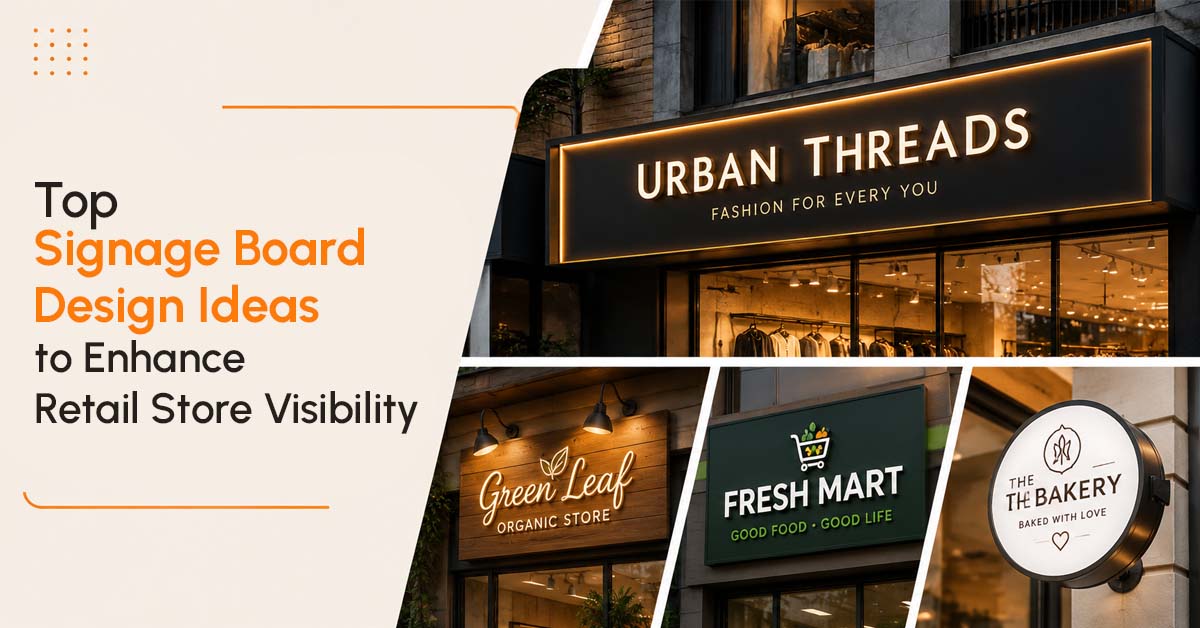
Top Signage Board Design Ideas to Enhance Retail Store Visibility
Walk any shopping stretch in Chennai on a Saturday evening and you’ll see the same thing play out over and over. Ten stores in a row, all selling roughly the same category of goods, and only two or three of them actually get a second glance from someone walking past. It’s rarely the product inside that decides which store gets noticed first. More often, it’s the board out front, and whether it was designed to actually catch an eye or just to state a name.
Good sign boards Chennai design isn’t about being the loudest thing on the street. It’s about a handful of deliberate choices that add up to a store people actually stop for.
Get the Typography Right Before Anything Else
A board can be beautifully lit, perfectly sized, and still fail if nobody can read the name from across the road. Fonts that look elegant up close often turn into an unreadable blur at fifty metres, which defeats the entire purpose of the sign.
A few things worth getting right here:
- Stick to bold, clean fonts over decorative or script style lettering for the main store name
- Keep letter spacing generous enough that words don’t blur together from a distance
- Make sure the store name is the visual anchor, not buried under a logo or tagline competing for attention
Contrast Does More Work Than Colour Choice Alone
Businesses often obsess over brand colours without thinking about how those colours actually read against the background behind them. A pastel sign on a light coloured building all but disappears in daylight, no matter how nice it looks on a laptop screen.
Strong contrast, dark lettering on a light background or the reverse, consistently outperforms subtle colour palettes when it comes to actual visibility. Brand identity still matters, but it needs to be built around contrast that works outdoors, not just indoors on a monitor.
Illumination Changes Everything After Dark
A sign that looks sharp at noon can vanish completely once the sun goes down, and for a lot of retail stores, evening footfall is when the real business happens. This is where LED sign boards earn their keep, staying sharp, bright, and consistent long after natural light is gone.
Backlit channel letters, edge lit acrylic panels, and simple LED strip lighting behind a metal name board all solve this problem in different ways depending on budget and storefront style. The specific method matters less than making sure visibility doesn’t quietly drop to zero the moment it gets dark outside.
Scale the Sign to the Storefront, Not the Budget
One of the most common mistakes we see is a sign that’s technically well designed but sized for a much smaller shop. A board that’s too small for its storefront gets swallowed up by neighbouring signage, no matter how good the individual design is.
The right size depends on viewing distance, how far away someone typically is when they first spot the store, whether that’s a busy main road or a narrower shopping lane. Getting this measurement wrong is an easy way to spend real money on a sign that still doesn’t get noticed.
Materials Should Match the Message
A premium boutique and a budget retail outlet shouldn’t be reaching for the same signage material. Metal letters and etched name plates communicate permanence and quality in a way that works well for established or upscale retail brands. ACP panels and acrylic boards offer more flexibility and cost efficiency for stores that want strong colour and graphics without that same premium price tag.
Neither option is universally better, the right material depends entirely on what the store is trying to say about itself before a customer even walks in.
Don’t Forget What Happens Once Someone Steps Inside
Exterior visibility gets most of the attention, but wayfinding and directional signage inside a store, especially larger retail formats, plays a real role in how comfortable customers feel browsing. Clear section signage and simple directional cues keep people moving through a store instead of wandering out frustrated.
Getting the Design Right the First Time
At Hitech Vision, we’ve spent more than thirty years watching what actually pulls a customer’s eye on a busy Chennai street, and the honest answer is rarely just “make it bigger” or “make it brighter.” It comes down to typography, contrast, scale, and material working together, matched to the specific storefront and the kind of customer that store wants to attract.
Whether you’re opening a new retail space or finally replacing a board that’s stopped doing its job, working with an experienced provider of name board makers in Chennai means these decisions get made with actual visibility data in mind, not guesswork. If your current signage isn’t pulling its weight, it’s worth a proper look before assuming the product inside is the problem.