
What Are the Essential Sign Boards Every Hospital Should Have?
A worried visitor rushes into a large hospital with an injured relative and stops in the lobby. There are corridors in three directions, no obvious sign for emergency care and a queue at the reception desk. Every lost minute adds to the stress. Good signage cannot treat a patient, but it can remove confusion, reduce delays and calm people when they are least able to think clearly.
This article walks through the essential sign boards a hospital needs, including entrance and identity boards, directional signs, department and ward signs, safety and emergency signage, regulatory notices, room-level labels and outdoor visibility, with tips on materials, language and maintenance. If you are planning sign boards Chennai for a clinic or hospital, it offers a practical checklist.
Why Hospital Signage Is Different
A shop sign attracts customers. A hospital sign guides people who may be anxious, in pain, elderly or visiting for the first time.
Visitors are often stressed and read signs quickly. Patients may have limited mobility or poor eyesight. Emergency situations leave no time for guessing. Many users are not fluent in the local language. Staff, visitors, ambulances and suppliers all follow different routes.
Good hospital signage is therefore clear, consistent and easy to read at a glance. The same colours, icons and fonts should be used throughout the building so people learn the system once and follow it everywhere.
Entrance and Identity Boards
The first sign people see sets expectations and helps them confirm they have arrived at the right place. A large name board visible from the road, carrying the hospital’s name and logo, anchors the entrance, and emergency access should be clearly indicated and kept separate from the main entrance. Visiting hours and key contact numbers belong near the main gate, and boards showing specialities and services should use simple language. Illuminated signs help with night visibility, especially for emergency entry.
Placement matters as much as size. The board should be visible from a distance and not blocked by trees, hoardings or parked vehicles. For ambulance routes, use reflective or lit signage so drivers can find the correct entry in poor weather.
Directional and Wayfinding Signs
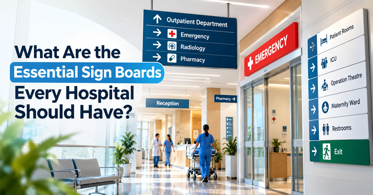
Once inside, people need to know where to go next. Directional signs reduce crowding at the reception and ease pressure on staff. Floor-wise directories near lifts and staircases give visitors an overview, while arrow signs at corridor junctions point the way to departments. Colour-coded zones or lines on the floor can lead people to key destinations, and maps showing the visitor’s current location help them orient themselves. Clear signs for lifts, ramps, restrooms and the pharmacy save unnecessary questions, and consistent numbering of floors, wings and rooms keeps the whole system easy to follow.
Place signs at decision points, where people must choose a direction, instead of only at the destination. Keep text short, and pair words with symbols so that someone who cannot read the language can still follow the route.
Department, Ward and Room Signs
Every department needs a board that tells patients they have reached the right place, without making them ask.
- Door-level signs for OPD rooms, labs, radiology, billing and pharmacy
- Ward names and bed number ranges
- ICU, NICU, operation theatre and recovery area labels
- Doctor name and speciality boards for consultation rooms
- Waiting area indicators and token display boards
- Staff-only and restricted access signs
Hanging signs perpendicular to the wall help people spot rooms from down the corridor. Flat door plates then confirm the details up close.
Safety and Emergency Signage
This category protects lives and is often subject to legal requirements, so it should never be treated as decoration.
- Fire exit signs, ideally with photoluminescent or illuminated elements for power cuts
- Evacuation maps showing the nearest exit from each floor
- Fire extinguisher, hose reel and alarm point markings
- Assembly point signs outside the building
- Oxygen, medical gas and high-voltage warnings
- Wet floor, slip hazard and caution signs
Exit signs should stay visible even during a power failure. Evacuation maps need to be mounted at eye level and updated whenever layouts change.
Regulatory, Hygiene and Information Notices
Hospitals also need notices that guide behaviour and meet legal requirements.
- No smoking and silence zone signs
- Radiation and laboratory hazard warnings
- Hand hygiene and mask instructions at key points
- Biomedical waste segregation signs, using the standard colour-coded bins
- Patient rights, grievance contact and rate or fee displays
- Visitor policy and photography restrictions
Use short, plain wording and standard symbols. Where space allows, show the notice in more than one language, such as English and Tamil, so more people can understand it quickly.
Accessibility, Language and Visibility
A sign that few people can read does not do its job, so accessibility should be built in from the start. Text needs high contrast against its background, such as white on dark blue or black on yellow, and fonts should be large and simple, without decorative curves. Key signs should carry Braille and tactile elements for visually impaired visitors, and every sign should be mounted at a height that is readable for everyone, including wheelchair users. Non-glare finishes stop lighting from washing out the text, pictograms communicate meaning without words, and bilingual or multilingual text helps more people understand at a glance.
Test the signs by walking through the building as a first-time visitor. Ask a few patients or relatives for feedback, because they notice gaps that staff overlook.
Materials, Maintenance and Working With a Signage Partner
Hospitals are busy, humid and heavily cleaned environments, so signs must last. Acrylic, aluminium composite and stainless steel stand up well to cleaning chemicals, while outdoor boards need weatherproof, UV-resistant finishes. LED lighting uses less power and gives steady, constant brightness. Replaceable inserts are useful when doctors or timings change, and regular checks should catch and replace faded, damaged or outdated signs before they confuse anyone.
Hitech Vision has been designing signs for businesses and institutions in Chennai for over 30 years, matching materials and lighting to real conditions. Its team lays out, sizes and finishes signs to be clear and durable.
A hospital that signs its spaces well makes every visit calmer, for patients and staff alike. Review each route from the gate to the ward, add signs where people hesitate and keep everything consistent. For a premium, long-lasting finish on the main entrance and reception, look for metal letters Chennai that hold their look through heat, humidity and years of cleaning.